The Ultimate Guide To Creating A Color System For Your Website And Business
Your website color scheme should play into the emotions you want your target customer to associate with your brand.
Let me repeat that, because as someone who used to practice design with a process deeply rooted in strategy, it’s one of the most important lessons I hope you'll carry with you in your business:
Your color scheme should play into the emotions you want your target customer to associate with your brand.
To be clear, the lesson here is that your target customer should be top of mind in all aspects of your business. Always. In everything you do. Above your own tastes and opinions.
If you haven’t thought about what you want your customers to feel when they interact with your business, make sure you give it some thought as you read through this post.
(As a side note, this post may be geared specifically towards websites but this information is absolutely essential for EVERYTHING related to your brand’s visual identity. Make sure you adapt the concepts from this guide into things like your social media graphics, advertisements, business card design, stationery, etc. Just….everything! And if you’re ready, start thinking about how you can make fonts work for your brand, too.)

There’s so much that goes into choosing colors for your brand and website, but before we discuss any of it let’s get the most basic thing about color straight: color at its core comes down to an individual’s perception.
Let's use the viral meme from early 2015 as an example: was it a BLACK and BLUE dress, or a GOLD + WHITE one?? We may never know!
Just kidding. It was confirmed to be black and blue, but there was serious debate all over the globe about it and it definitely shows you how nuanced color perception can be.
Anyway, what we want to do with color on our website is harness that power of perception to make a positive impression on our audience.
Physical perception of color isn’t the only thing that comes into play when choosing colors for your brand and website. What’s even more important are the emotional associations we humans tie to color.
There are some pretty amazing facts and statistics about how our brains process color, and how big a role it subconsciously plays when we make decisions:
85% of consumers feel that color is the primary factor when choosing a product.
90% of people feel color can assist in attracting new customers.
Within 90 seconds a person will make a subconscious judgment about a person, product or environment. 62-90% of that judgment is influenced by color alone.
Color increases brand recognition by 80%.
A product has one-twentieth of a second to halt a customer's attention on a shelf or display (that’s not a lot of time!). Using color has the potential to hold attention 3 times longer than if the same object was in black and white.
Since people can’t process every object within view at one time, you can use color to your advantage to emphasize or de-emphasize areas.
Generally speaking, vision is our primary source for all experiences. 80% of what we assimilate through the senses is visual.
(All information above sourced from here).

Now, I know that information is cool and all - but what does it mean for you and your business?
There are a few key things I’m going to break down for you first to make sure you really understand how colors can work together for your benefit. If you take some time to think through it now I know you’ll be surprised at the positive impact it will have on your business.

SECTION ONE
Color Basics
When combining colors for your website, you want to make sure your brand colors exist well together, aka that your website color scheme has harmony.
We’ll look to the color wheel to help us form a few natural harmonious relationships:

Photo Sources: Red, Red Orange, Orange, Yellow Orange, Yellow, Yellow Green, Green, Blue Green, Blue, Blue Violet, Violet, Red Violet
Monochromatic: One color and any of its tints, tones + shades (I’ll explain what those mean below)
Complementary: Colors that are opposite of each other on the color wheel. They’re called complementary because each of the colors equally intensifies the one across from it.
Triadic: Forms a triangle out of every 4th color on the color wheel
Analogous: 2-5 colors that sit right next to each other on the color wheel
Here are some examples of websites using these color harmonies:

Source: Monochrome / Complimentary / Triadic / Analogous
A big rule I have (and something I see a lot of DIYers do) is never, ever, ever use a color in its pure form.
There are 12 pure colors (3 primary, 3 secondary, 6 tertiary) and a simple way to mix those up is to create tints (adding white to a color), shades (adding black) or tones (adding both black and white - aka grey).

Photo sources: Pure Color, Tint, Shade, Tone
Tints usually feel soft, whimsical, feminine or soothing.
Shades usually feel deep, masculine or mysterious.
Tones are more complex and can feel more pleasing, refined or sophisticated.
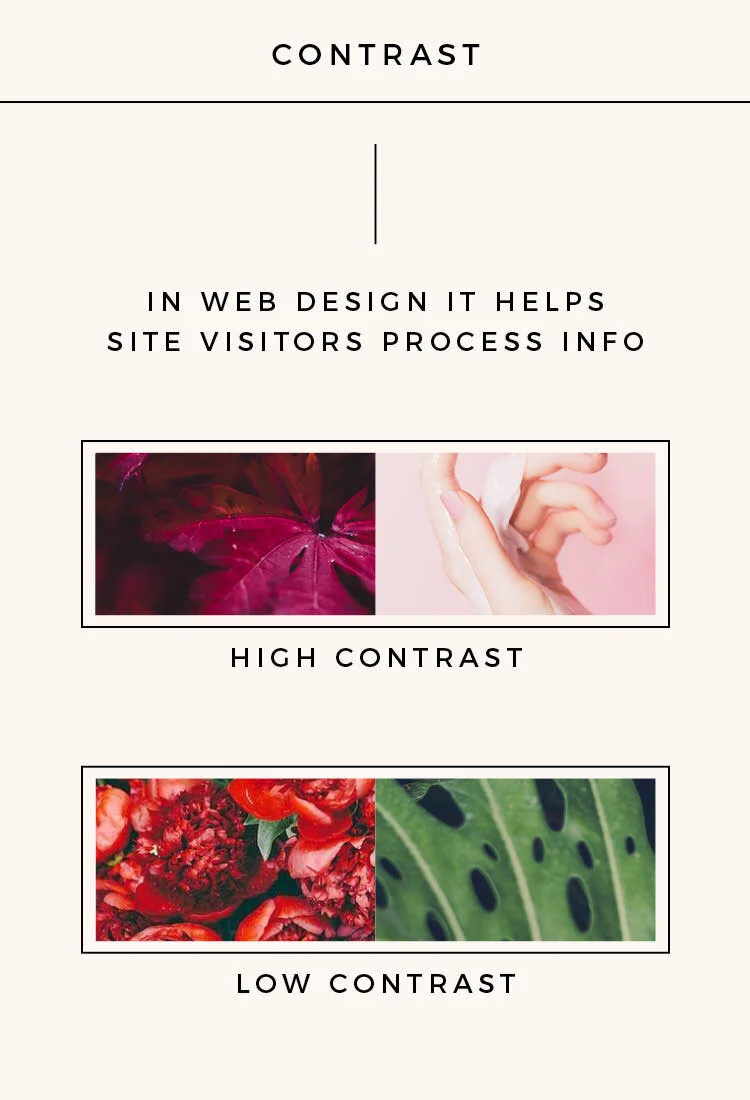
Photo Sources: High Contrast Left, High Contrast Right, Low Contrast Left, Low Contrast Right
Experimenting with tint, shade and tone means you’re making your colors lighter and/or darker. This will help you establish contrast, which is an insanely important element when it comes to web design because it will help your audience process information and can be used to highlight the most important things on your site.

Photo Sources: High Vibrancy Left, High Vibrancy Right, Low Vibrancy Left, Low Vibrancy Right
One final thing to consider for your website colors is vibrancy. Vibrancy is simply a color’s strength and is important in establishing your brand’s energy level. Bright colors will feel energetic and muted colors will feel subdued or calm.
You can influence a positive experience on your site by helping your visitors process information through thoughtful contrast, and establish your brand’s energy with your vibrancy levels.

SECTION TWO
Color Associations
Think about what you want your brand to stand for, then consider the following common associations people have with different colors:

Photo sources: Red, Orange, Yellow, Green, Blue, Violet, Black, Brown, White
Here are some common color associations:
Red: bold, passion, strength, love, urgency, action, impulsivity
Orange: happy, friendly, cheerful, affordable, warm, energetic
Yellow: optimistic, playful, creative, confident, youthful, warm
Green: wealth, health, freshness, nature, growth, luck, can be relaxing
Blue: conservative, honest, secure, calm, trusting, productive
Purple: imaginative, upscale, creative, royal, calm, successful
Black: luxury, control, authority, edgy, mystery, formal, sophisticated
Brown: secure, wealth, down to earth, duty, comfort, protection
White: cool, complete, clean, innocent, growth, fresh, pure, open

SECTION THREE
Creating Your Color Scheme
I want to tell you about a little design formula called the 60/30/10 Rule. This rule was originally created for interior design but has since been adopted across multiple disciplines in the design world.

In its simplest form, the 60/30/10 rule states that you choose 3 colors and assign them hierarchy: 1 dominant, 1 secondary and 1 accent. Your dominant is used 60% of the time, secondary is used 30% and your accent is used 10% of the time.
(Something to mention about the 60/30/10 Rule for websites is that the rule applies to COLOR, so your white background doesn’t count unless it’s something you’ve included in your final 3 colors. Refer back to my site examples above to see what I mean.)
Here are some light/dark/accent examples using the 4 color relationships from earlier:

Photo sources: Monochromatic Light, Monochromatic Dark, Monochromatic Accent + Triadic Dark, Complementary Light + Triadic Accent, Complementary Dark, Complementary Accent, Triadic Light, Analogous Light, Analogous Dark, Analogous Accent
Now, if you need any help coming up with your color scheme you should try using this really cool online tool I found called Paletton (it's free!).
Here's how to use Paletton:
First you'll want to pick your color relationship (monochrome, adjacent, etc). There's a tool just to the right of it that lets you choose the distance between the color points on the wheel if you want to adjust anything. My example below shows a triadic color relationship with 30° as the default distance then it switches over to 90°:

If you want to adjust the contrast just click and drag the dots in the middle. You can also rotate these dots:

There are also presets that can help you fine tune your scheme:

You can even preview your colors in a website mockup:
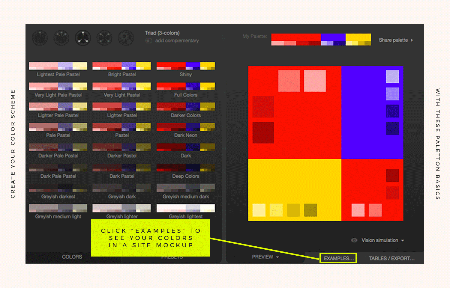
It might take a little experimentation so try to have fun during this part of the process! If something feels off be sure to pay attention to what’s going right with the combo, then start tweaking other elements.

SECTION FOUR
Applying Color To Your Website
Now you simply need to give your dominant, secondary and accent colors specific jobs on your website.
Here are some ideas for how to do this:
Dominant (60%): logo or navigation bar, H1 (headline 1 text), big blocks of color behind text, footer, background color
Secondary (30%): page links, "active" page (navigation), H2 (headline 2 text), horizontal line
Accent (10%): H3 (headline 3 text), call to action buttons

Make sure to consider your color scheme for your photos, patterns, icons and illustrations used on your site too! I love the way my bud Allison of Allie Marie Designs does this with her site photography (dude, go check it out).

LET’S SUM IT UP
Takeaways
Put your audience first when brainstorming colors for your brand and website. What will appeal to them and make their visit to your site the best possible experience?
Utilizing high contrast (especially with text) will help level up your site experience (nobody wants to squint to read something!) and can even influence how your site visitor’s flow through your website (use high contrast or a pop of color to draw attention to your graphics and call to action buttons to keep people clicking around).
Brighter, vibrant colors will require more mental energy, so make sure you think about what kind of energy level you want to offer your site visitors.
When forming your color scheme use this simple formula as a starting point: 1 light color + 1 darker color + 1 pop or accent (or you could use 2 colors with high contrast if you wanted to simplify it even more).
Incorporate the 60/30/10 Rule when it comes to color on your site: 60% of your color should be your primary color, 30% should be secondary and 10% should be your accent color.
Don't forget to apply this rule to anything you create for your business!
So like I mentioned earlier, this guide is seriously just a base to get you started with your website and brand's color schemes in a systematic way. I really hope you'll apply these basics then experiment until something feels right for you. And if you haven't checked it out yet, you should take a peek at the other ultimate guide I made for fonts on your website!


